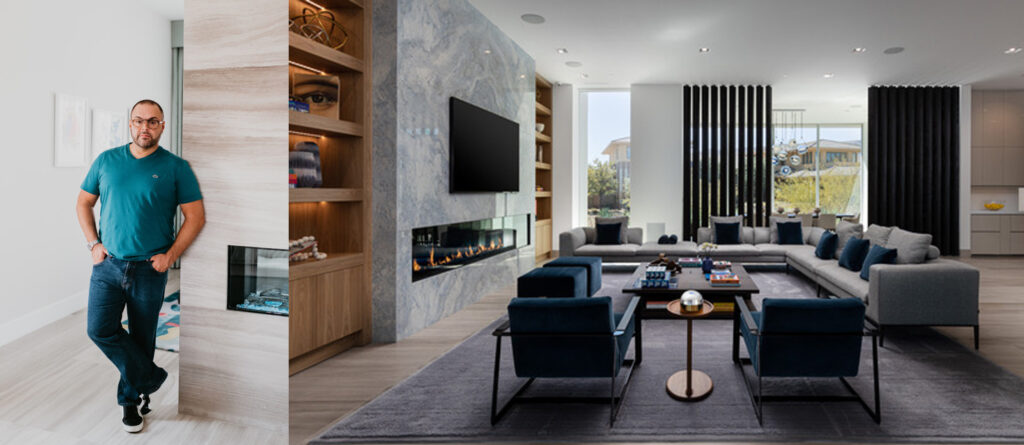
Based in Las Vegas, Joseph works throughout the United States in exclusive areas and communities such as The Ridges, Santa Barbara, Chicago’s River North and Gold Coast, Manhattan’s famous Fifth Avenue and The Hamptons. He joined us to talk about how paint and colour influence his projects.
Can you describe your design philosophy and how it relates to incorporating paint and colour in your projects?
My design philosophy is to create timelessly modern sophisticated spaces that reflect my client’s personalities. I use colour to invoke different feelings throughout a collection of spaces.
How do you stay current with the latest colour trends in the interior design industry?
I stay recent with the latest colour trends by reading a lot of magazines. I also pay close attention to the fashion industry however it is travel that inspires me the most and fuels my creativity.
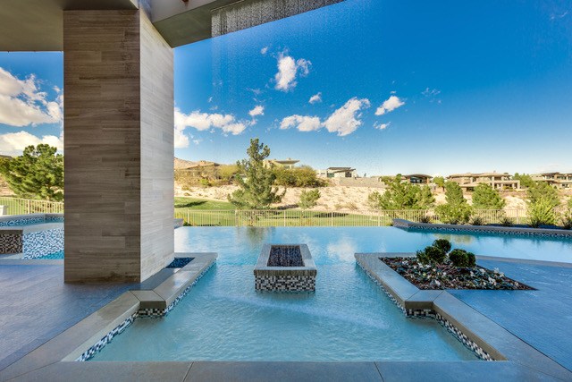
Can you walk us through a recent project you completed in the U.S. and how paint and colour played a role in the design?
I recently completed a project here in Las Vegas in which both paint and colour played a large role. And by that I mean I used paint to create a calm clean environment and then layered in colour through art and accent fabrics. This resulted in the home feeling serene but not cold or predictable.
How do you approach creating a colour scheme for a space and what factors do you consider?
I often start by examining the amount of windows in a space, their exposure,
and whether I should add or delete some. From this I work through the roles colour will play in each space and how I can use it to create a narrative throughout the spaces—making them feel connected yet at the same time independent.
Do you have an example of a time when you had to use colour to solve a design challenge in a project?
Referencing my examination of glazing throughout a space I had the challenge of having spaces both flooded with light and some with no windows at all within the same home. So, I used colour to balance this by employing lighter, more vibrant colours in the darker spaces and darker tones of the same hues in the lighter which proved to be successful.
How do you incorporate the client’s personal style and preferences into the colour choice for their space?
I always spend time in my client’s closets, this gives me a true understanding of colours they are drawn to and I use that time for both building initial colour themes and to also understand what type and size of closet I will design.
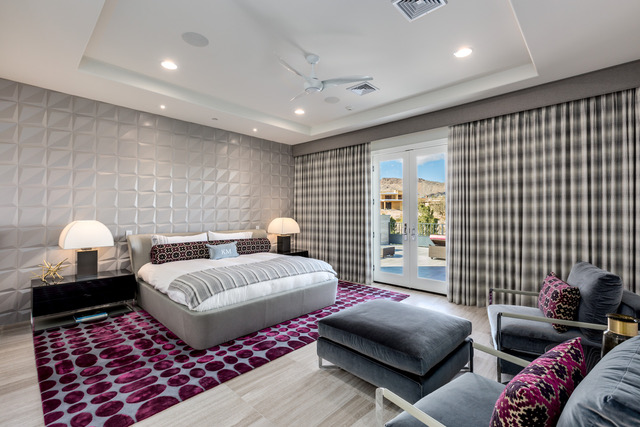
How do you balance the use of bold and neutral colours in a space to create visual interest and harmony?
I tend to balance my use of bold with neutral colour by deciding early on how saturated a space needs to feel, that sometimes changes as the process evolves but I’m of the belief that you need a balance of both to create a visually interesting space.
What role does natural light play in shaping your colour choices and working with it in your designs?
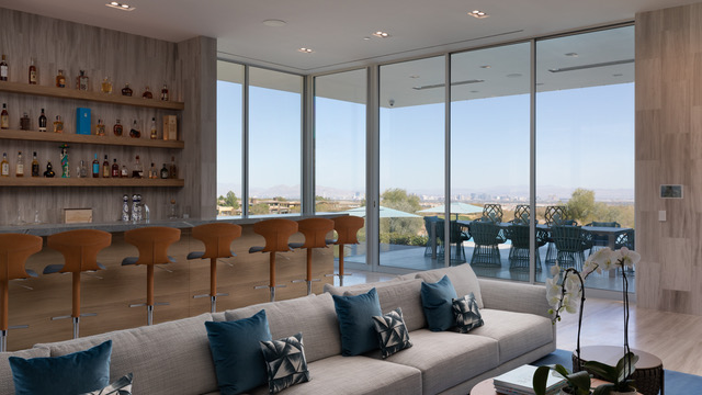
Natural light is super important to me when deciding how I will apply colour and to what levels that should be saturated. I am a lover of brighter spaces, not to say white but bright in how the collection of colour and finish make the space feel—both in the evening and the daytime. I also enjoy creating spaces that allow for dramatic differences in ambience from day to night.
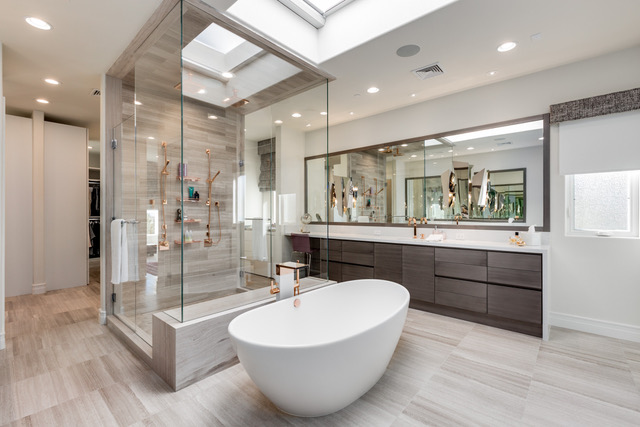
Describe a project where you used paint effects, such as a special finish or pattern to add interest to a space?
In a recently completed project I used a few different custom plaster finishes throughout the space to add texture. This also allowed me to play with slight colour variations to create shadow and light variances where natural light wasn’t going to deliver them on their own. This added the subtle drama I was looking for.
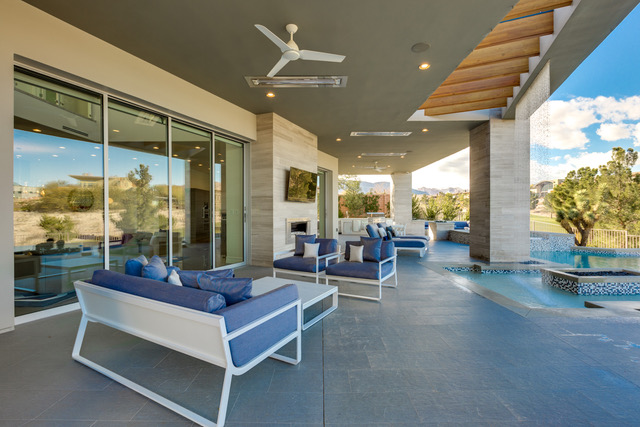
As in the Middle East, Las Vegas has extreme temperatures. How do you ensure that the paint and colour choices you make withstand that intensity of light and heat?
I pay close attention to the type of materials I use outdoors in Vegas to ensure longevity of my projects aesthetic. I also use UVA/UVB films on most glazing. My clients typically have delicate fabrics and expensive pieces of art that we want to protect from our intense sun.
How would you say colour psychology impacts on interior design and do you reference it in your work?
Colour Psychology is definitely important when designing spaces. Since I use colour to invoke feeling into a space it is something that I always carefully consider. The aim is for the end user to subconsciously feel what you are intending as they experience and live in the finished space.
Do you have a tip to share for individuals looking to incorporate paint and colour into their homes?
I say never be afraid to use colour whether it is a neutral or a vibrant hue. Simply be intentional with its application and be sure to think how and when you will use it again in an adjoining space.